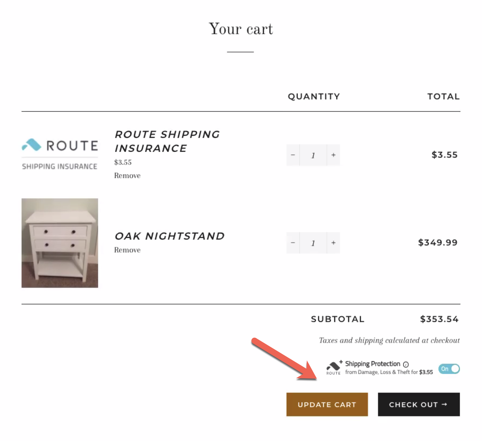
The swipe div code, <div class="swipe-div"></div>, should go directly above the checkout option(s) on your website. For exact steps, see videos 3 and 4 in the video guide. The following sections outline common swipe asset styling solutions. Use the steps outlined in the applicable section to fix the swipe asset styling.
Shopify Self-Install Troubleshooting FAQ
Need some help? Not to worry! All merchants have access to free, expert implementation from the swipe team. Reach out through this form, and our merchant support team will file a request on your behalf.
 Where do I place the swipe div code?
 What if the swipe asset is too far to the left/right?
When the swipe asset is implemented on your site, it might appear too far to the left or right. The swipe asset should appear above the checkout button. If the swipe asset is appearing to the left or right of the checkout, follow these steps to fix the alignment of the swipe asset:
- In Shopify, go to the Online Store > Themes.
- In the Theme library, find the swipe Test theme and click Actions > Edit code.
- In the new page, click on the Sections folder and open the applicable file for the checkout option.
- Use Ctrl + F to search for the swipe div code: <div class="swipe-div"></div>.
- Copy and paste the following options depending on the alignment issue:
- desktop-align="right" - will move the swipe asset to the right of the page
- desktop-align="left" - will move the swipe asset to the left of the page
- desktop-align="center" - will move the swipe asset to the center of the page
-
For example, if the swipe asset is showing to the left of the checkout, add desktop-align="right" to the div code.
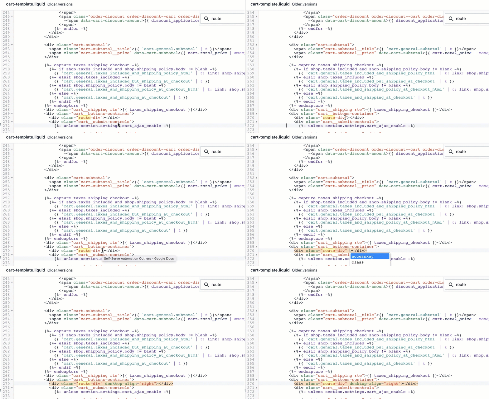
- Click Save at the top right.
- Open the Preview in Google Chrome's incognito mode and test the checkout to see if the swipe asset appears in the designated checkout location. The swipe asset should then be pushed to the right and located above the checkout button.
 What if the dark background makes the swipe asset less visible?
When the swipe asset is implemented on a website or checkout option with a dark background, it may not be clearly visible to your customers.
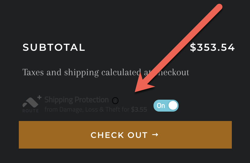
To resolve this, you can use the "dark-ui prop".
Follow these steps to fix the issue:
- In Shopify, go to the Online Store > Themes.
- In the Theme library, find the swipe Test theme and click Actions > Edit code.
- In the new page, click on the Sections folder and open the applicable file for the checkout option.
- Use Ctrl + F to search for the swipe div code: <div class="swipe-div"></div>.
-
Add the dark-ui code. It should look like <div class="swipe-div" dark-ui></div>.
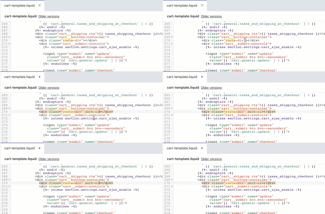
- Click Save.
- Open the Preview in Google Chrome's incognito mode and test the checkout to see if the swipe asset is showing with white font color and fully visible.
 What if there is too much white space between the swipe asset and the checkout option?
When the swipe asset is implemented on a website or checkout option with too much white space, you can increase or decrease the margins between the swipe asset and the elements around it.
For example: In the screenshot below, there is unnecessary space between the swipe asset and the checkout option below it.
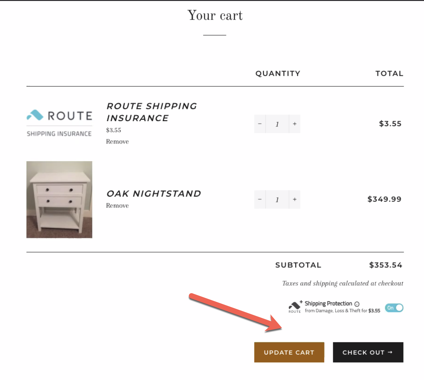
If the swipe asset has large margins and too much white space between the elements around it, follow these steps to fix the margins:
- In Shopify, go to the Online Store > Themes.
- In the Theme library, find the swipe Test theme and click Actions > Edit code.
- In the new page, click on the Sections folder and open the applicable file for the checkout option.
- Use Ctrl + F to search for the swipe div code: <div class="swipe-div"></div>.
- Use the following options depending on where you need to adjust the margins–above, below, to the left, or to the right of the swipe asset:Note: The number associate with px (EX: 30px) can be any number depending on the amount of space/margins you are increasing or decreasing.
-
Changing the margins below the swipe asset
- style="margin-bottom: -30px;" to decrease margins/white space
- style="margin-bottom: 30px;" to increase margins/white space
-
Changing the margins above the swipe asset
- style="margin-top: -30px;" to decrease margins/white space
- style="margin-top: 30px;" to increase margins/white space
-
Changing the margins to the left of the swipe asset
- style="margin-left: -30px;" to decrease margins/white space
- style="margin-left: 30px;" to increase margins/white space
-
Changing the margins to the right of the swipe asset
- style="margin-right: -30px;" to decrease margins/white space
- style="margin-right: 30px;" to increase margins/white space
-
For example, if the swipe asset is showing with too much white space between it and the checkout, use: <div class="swipe-div" style="margin-bottom: -30px;"></div>. This will decrease the extra space below the swipe asset.
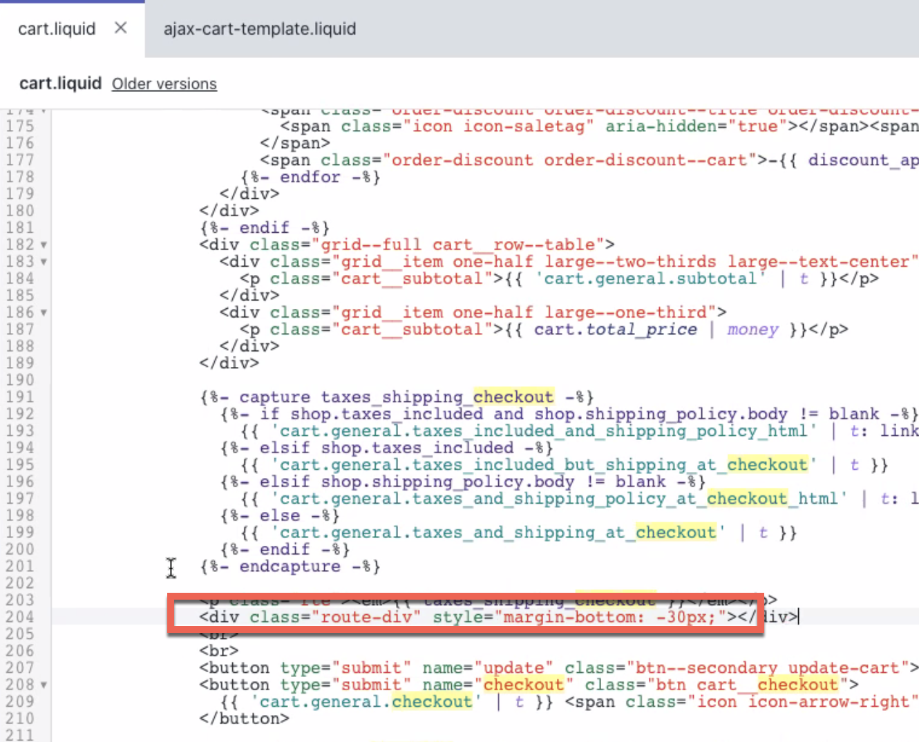
- Click Save at the top right.
-
Open the Preview in Google Chrome's incognito mode and test the checkout to see if the swipe asset no longer has extra white space.
